The Context
Lafferty Architects approached us to help them reposition their business in 2020. As a leading architectural firm in the market for over twenty years, their imprint across the Irish landscape is substantial.
Specialising in the workplace, residential, mixed-use, retail and healthcare builds, Lafferty Architects’ purpose is ‘innovation through design’. That being said, Lafferty Architects felt they were lacking a dynamic brand identity that would drive them forward and succeed in positioning them for their next phase of growth. That’s where we came in.
The Challenge
In order to effectively reposition Lafferty Architects for the market, we first had to conduct a brand audit. Herein lay key findings on certain challenges and opportunities that Lafferty Architects, as a brand, needed to consider.
In a market that is largely oversaturated, our challenge was to get deep under the skin of the brand and to understand their core strengths and differentiators. Armed with this intel, we used these learnings to inform a refined brand image that would cut through the noise and help them stand out against their competitor set.
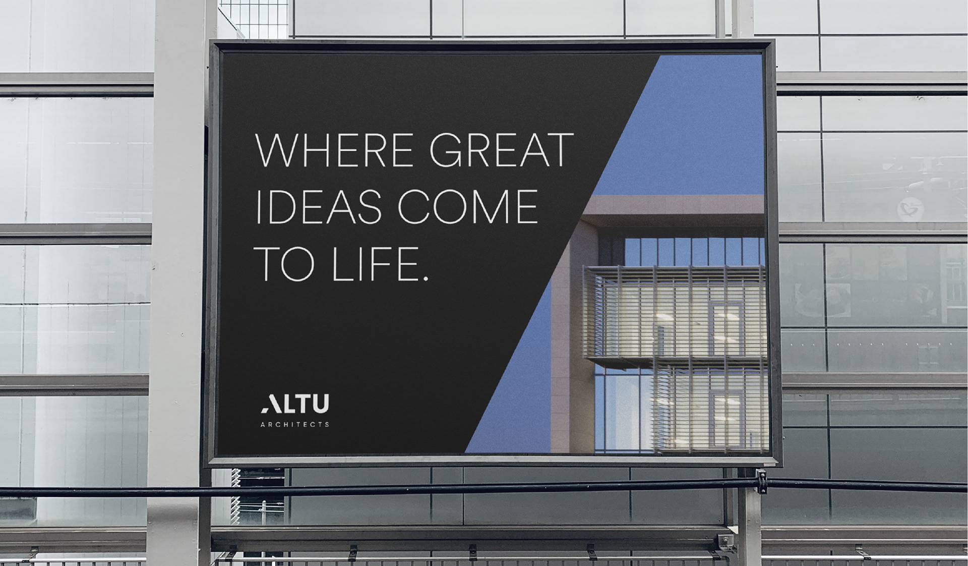
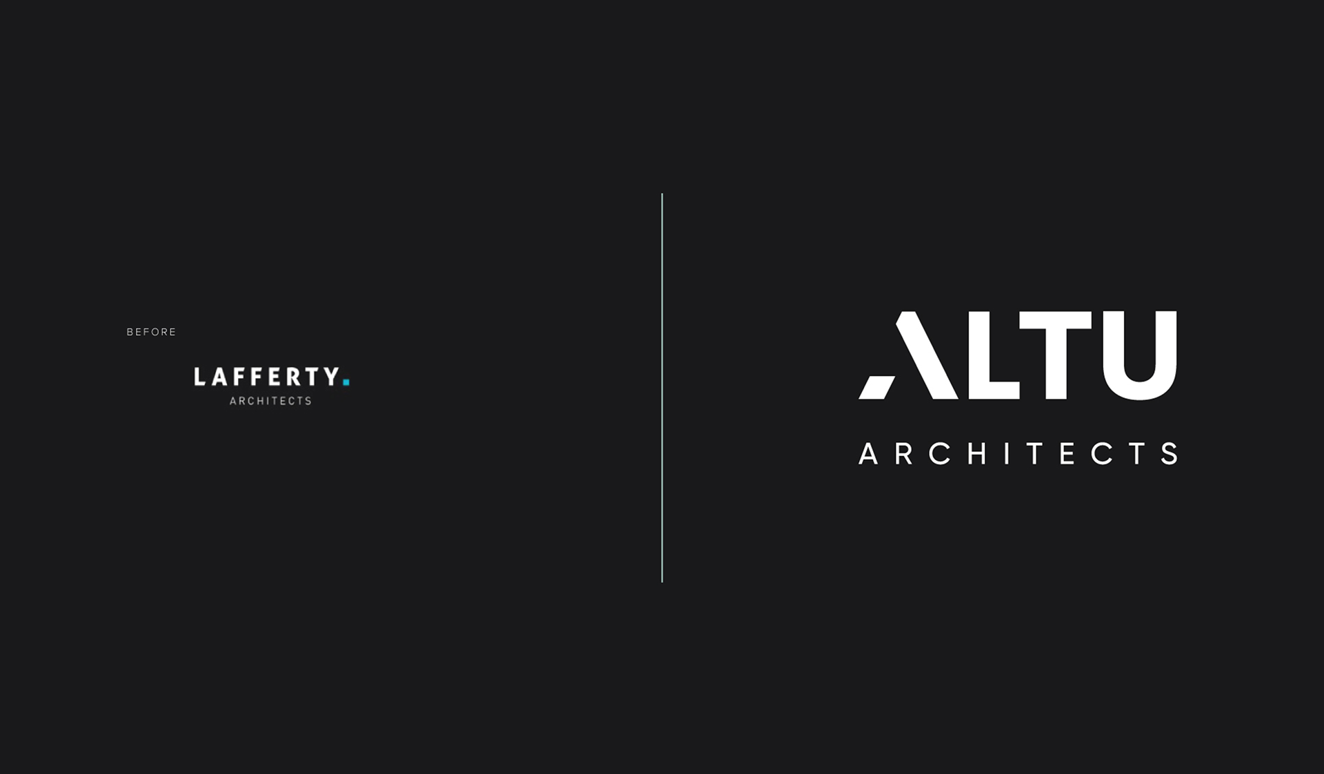
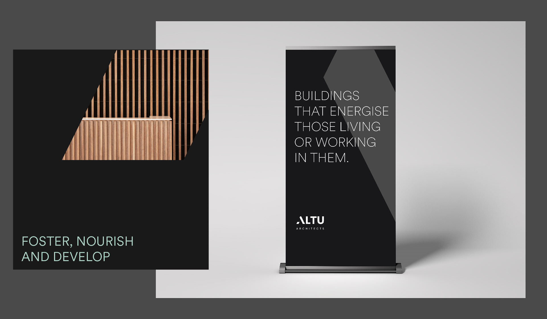
To effectively reposition Lafferty Architects with impact, it became clear that a strategically-driven approach would be crucial in order to capture the values and goals of this dynamic brand and help evolve its identity. Through a series of deep-dive workshops with Lafferty Architects’ key associates and leadership team, it became apparent that a new name and visual identity would be needed to successfully reposition Lafferty Architects. As a result of a series of workshops and in-depth research, the name ALTU – meaning ‘foster, nourish and develop’ – was chosen.
The Idea
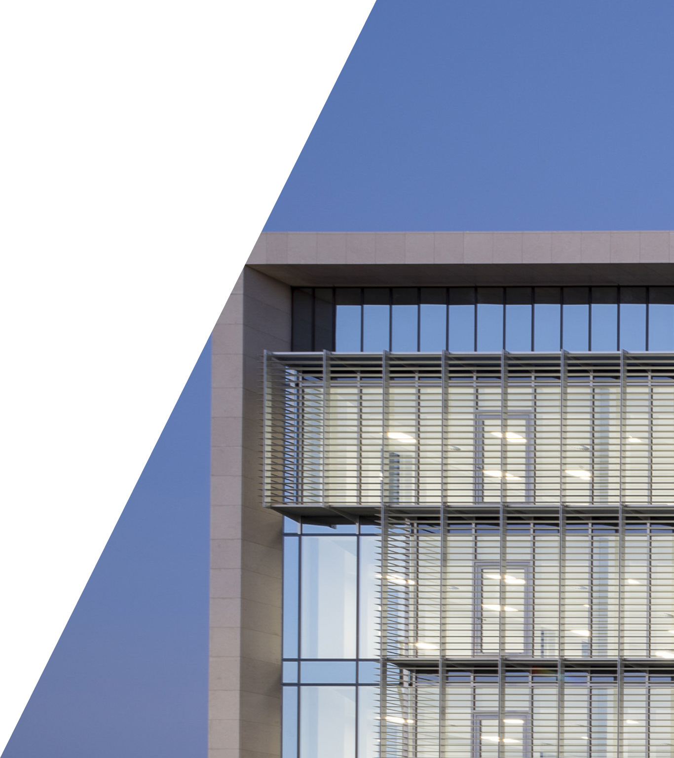
Working closely with the key decision-makers, directors and associates at ALTU, we bottomed out on a focused creative direction for the newfound visual identity. Inspired by strong, solid shapes and the materiality of the architectural practice, the idea for the visual identity was distinct and attune to the client’s vision for the brand today, and into the future.
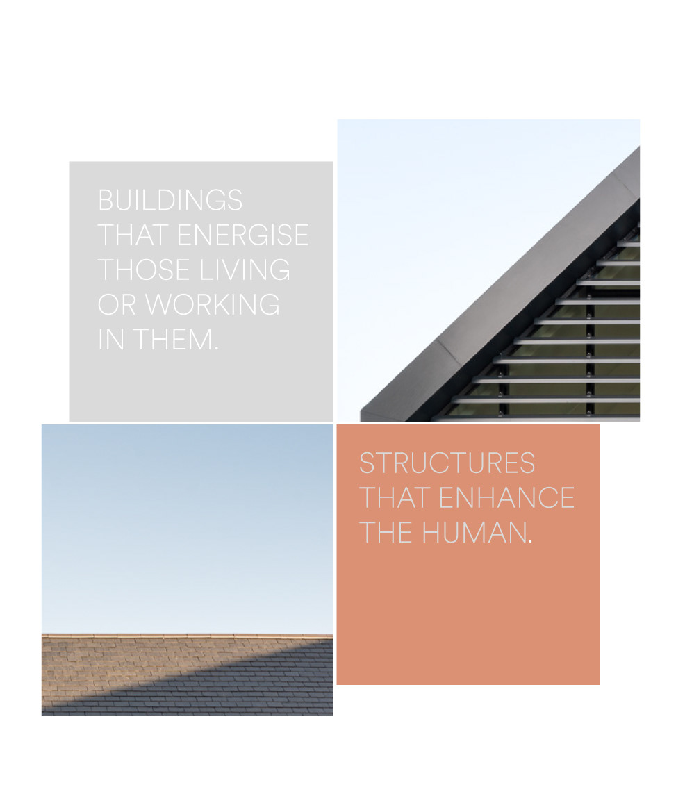
Our goal was to create a visual style that would connect naturally to the new name and the strategy, while also supporting and elevating ALTU’s portfolio and their projects of merit.
The Creative
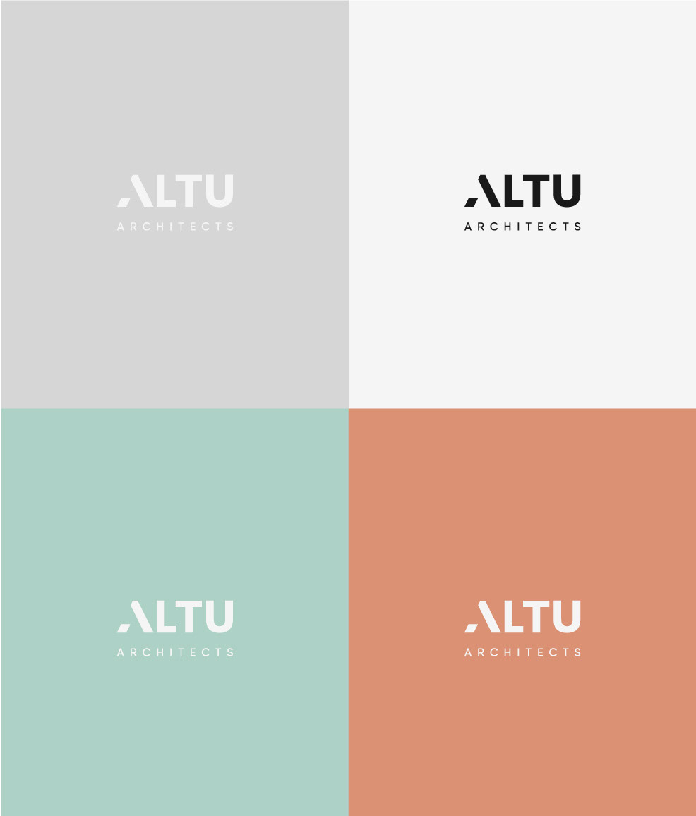
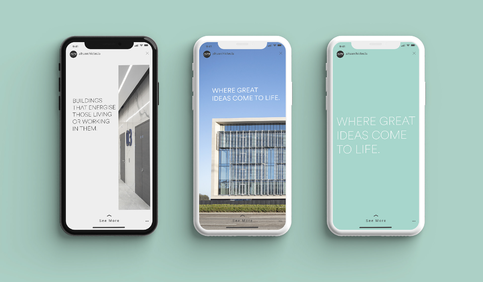
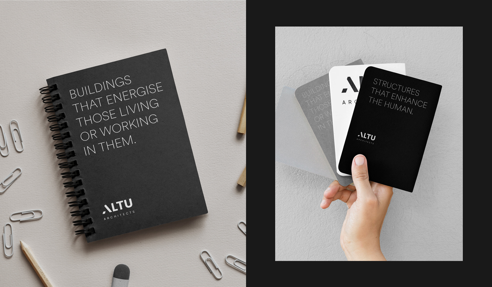
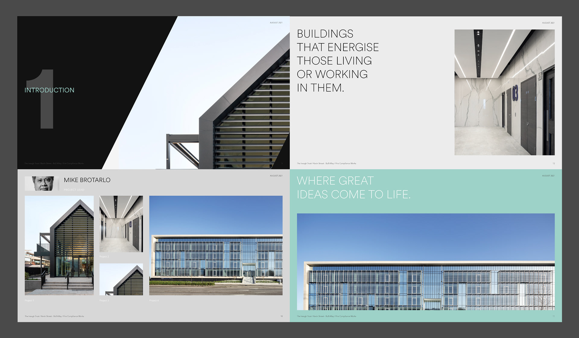
For the purpose of this project, custom typography was developed for ALTU. The unique font was designed in such a way that the letters themselves could become frames and inspire the visual language. The visual language was created to be minimally intrusive. This being said, the colours are neutral in their majority.
Only two accent colours give further vibrancy and support bringing the brand to life. The imagery is deliberately elevated when used in combination with shapes that have originated from the lettering, creating a distinctive yet elegant suite of assets.
Activating the Brand
When approaching this project with ALTU (formerly Lafferty Architects), one of the most distinct challenges was developing a unique and compelling new brand identity that would resonate with customers and clients in the market, without losing sight of the brand’s core values and mission.
Achieved through deep strategy sessions and explorative work in visual identity and devices, the result of our work with ALTU was a market-ready brand with a memorable, engaging and dynamic name and brand identity.
Reflecting on the newfound brand identity, Jack Byrne, Associate Director of ALTU (formerly Lafferty Architects) says:
“I have said it before and I will say it again: I would recommend working with The Pudding to anyone. The proof is in The Pudding – it’s in the brand. With ALTU, we got exactly what we wanted… We were always able to have a good honest and open conversation and relationship with The Pudding and anything that popped up was handled in a very professional manner. We are very happy and so excited to launch the brand.”